We often told by our customers and users that after calibrating their monitor (or display) the images still do not look that good. When we ask for the details on what 'does not look that good' means we realize that sometimes expectations often exceed the real world results and what is physically possible.
Remember that your display is an light emitting device - it starts out black and adds amounts of RGB to display images - hence it is Additive Colour. Your prints however start out white, usually, as the paper or substrate is reflecting almost all of the reflected light. As CMYK is printed onto the substrate the reflected light is subtracted - hence printing is the opposite being Subtractive Colour.
If you think you are having trouble with monitor to print colour matching then you are maybe expecting perfection, which not entirely possible. Yes, we can achieve acceptable monitor to print colour matching, but, in the end, we are tricking our human visual system to see an emissive response match a reflected response!
Ok, you may not care about matching your colour prints from your display and you are still having trouble achieving an acceptable display calibration that produces good colour, in your eyes.
What might be the Trouble?
My Monitor Now Looks Yellow after Calibration and Profiling
In the first instance it could the white point setting you are using in the calibration process. Basically you will go from a 'yellowish' white through to a 'bluish' look by moving the white point from 5000K to 6500K.
 In colour management (CM) there a few rules and basically we usually measure with a D50 light source which correlates to a colour temp of 5000K. And viewing of printed materials (photos, offset or digital printed matter) should be colour evaluated under D50 lighting - according to ISO 3664.
But 5000K on a display usually does not visually equal 5000K lighting or D50 viewing conditions. we may have to use somewhere between 5400-5800K to achieve an acceptable white point match to prints. Some prefer to the white point at 6500K. It is also possible to use some colorimeters to measure the ambient light and then use that as your white point.
In the End I Find 5500K as a Good White Point.
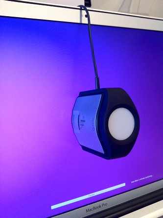
There are number of other possibilities that could be causing your strange display colour cast after profiling. Your colorimeter (think i1 Display Pro or Spyder) could be faulty and/or the filters could have deteriorated over time. See if you can get hold of another colorimeter and see if this improves the results.
It could be that your display is very old and/or your colorimeter is very old and you are using the old colorimeter on a brand new display. Monitor technology has changed a lot recently with OLED, White LED and/or RGB LED, CCFL, wide Gamut CCFL, etc. backlights.
And, if you are using a lower cost monitor you should trying to achieve your calibration settings (white point, luminance, contrast, etc) by adjusting the monitor controls (on the monitor itself). This may require you to access the OSD (On Screen Display).
<IMPORTANT> Doing as much as you can to hit your calibration targets with the monitor controls means the adjustment to your video card LUT's will be reduced or minimised.
We should also mention, and as explained before in our blog https://www.colourgraphicservices.com/blog/monitor-calibration-what-settings-to-use - please try to use a good quality monitor, the best you can afford - with monitors we always say, "You only get what you pay for!"
The New Monitor Profile does not Look much Different to Before!
Some monitor profiling software packages allow to see the results of your new profile compared to previous. This is done by switching the video card LUT's (look Up Tables) between the new and old settings. Sometimes if there is little difference it can be a good thing. It can mean that you have been able to calibrate your monitor to the targets, very accurately, using the monitor controls (WELL DONE!).
Which in turn means the video card LUT's are not having to make major adjustments to achieve the colour targets. If the video card LUT's are being 'twisted' or adversely adjusted this can introduce visual anomalies to images - i.e. problems you see in images on the monitor that are not really in the image itself - they are introduced by the monitor profile!
My Images Look too Dark or Overs Aturated in Colour on the Internet!
 The Adobe CS suite (Photoshop, Illustrator, InDesign, Light room, etc.) supports monitor profiles (Mac and PC) but various web browsers can give you colour over saturated or too dark result. However, having said that if you are using the latest version of your preferred browser on a desktop computer then the ICC profile embedded in the image will be recognised.
Sounds like magic eh! Yes, if you have embedded Adobe RGB or ProPhoto RGB into your images the desktop browser should recognised it and display the image colour as correctly as possible. However, there is still an issue with smart phones and tablets as they are unable to read ICC profiles. And with the proliferation of tablets you may still have to embed RGB to get continuity and consistency of colour across desktops, smart phones and tablets.
There is quite a bit of detail about this on a good blog at https://www.color-management-guide.com/web-browser-color-management.html
Hope this has helped and assisted you in some way.
For more information about digital colour management and our ICC profiling service please contact us at info@colourgraphicservices.com
