Colour evokes a response. Colour communicates to us and ultimately, colour sells. As consumers we are influenced by the colour of many products we look at and buy. Ask anyone in advertising and they will tell you that colour can be critical to a brand or products success.
Designers, advertising agencies, photographers, those involved in graphic arts, prepress and print all know that colour is pivotal to the process of selling - it is a paramount part of the sales or selling process. The value and importance of a product can be depend on whether colour is used effectively in the manufacturing and marketing of that particular piece or element.
Throughout the supply chain and manufacturing process colour requires good management and should be kept under tight control.
So, what is all the fuss about? There are rules in colour theory and that we need to know.
There is No Colour Without Light.
Some say colour does not exist - it is in our mind or imagination. You may have heard that without light there is no colour - True! The colour message in our brain is strictly determined by what we are seeing, and what we see depends on the lighting situation - outdoors sunny, cloudy, morning, afternoon, night or indoors with artificial lighting (incandescent light bulb, fluorescent tubes, LED lighting) are a few everyday situations we might find ourselves in.
We Process Colour in RGB (Red, Green and Blue).
The human visual system does have three channels, RGB, which are the three different cone types in our retina for conveying colour information to the brain.
This is known as trichromacy and makes humans known as trichomats. It reported by 'experts' that we can see up to around 10 million colours from a probable 6 millions cones in our eyes!
The Colour on My Monitor, in My Photo or in the Printed Result does not Match How I Eee the Colour of That Object Visually.
There is not a known device (camera, scanner, monitor or printer) that can capture or display the absolute visible colour space. At the moment there are physical limitations of colour monitors/displays and printing processes that means we cannot always reproduce exactly what we see. Also, devices can operate in different colour spaces, RGB or CMYK (Cyan, Magenta, Yellow and Black) with different colour capabilities and gamuts.
Good management of colour and calibration of your print workflow though can go a long way to improving device to device colour matching and improving the colour accuracy back to the original sample(s).
There are a Couple of Distinct Ways to Build and Compose Colour.
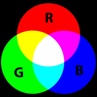
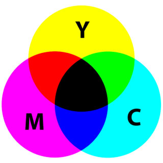
There is additive colour, the RGB model, and subtractive colour, the CMYK model.
Additive Colour starts off with black - by adding differing amounts of RGB you achieve bright, saturated colours - interestingly, equal amounts of RGB at full intensity will produce white (well, a sort of white) - equal amounts of RGB with lower intensity produces grey. Examples of additive colour are a monitor, TV, computer display, your smart phone screen, tablet screen.
Subtractive Colour starts with white paper and mixtures of CMYK inks to produce a wide array of colours. Fairly simple really - no CMYK ink means you just have white (the paper). Adding just cyan and yellow will give you green - magenta and yellow will provide you reds and oranges. If you remember using paints at school you might have used the colours red, blue and yellow to give you most colours. CMYK refines the subtractive process within colour print reproduction today.
The Amount of RGB or CMYK can be Described to Reproduce Colour.
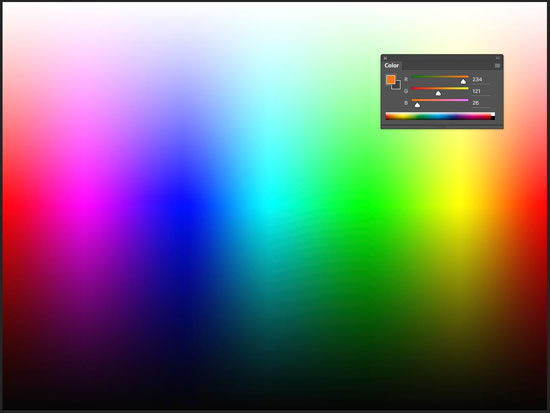
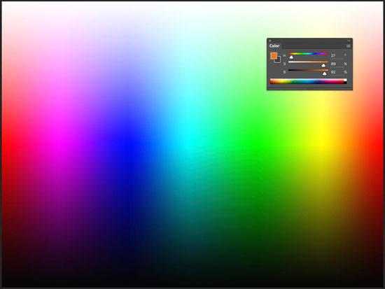
Each of the above could be called a model, but I prefer to call them colour spaces. There are numerous 'models' - HSL Hue, Saturation and Lightness, HSB Hue, Saturation and Brightness, for example.
RGB is described numerically 0-255, with RGB at 0,0,0 being black and 255,255,255 being white.
What about ROYGBIV?
Red, Orange, Yellow, Green, Blue, Indigo, Violet - a sequence of colours seen in a rainbow. This shows the visible colours in the spectrum with graduation between each hue. This is often used to produce a circle of colour that can enable you to choose colour(s) easily.
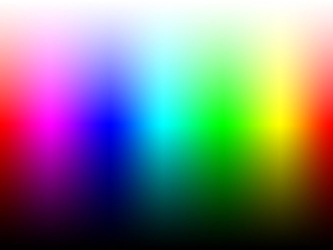
Some say this acronym can remembered by 'Richard Of York gave battle in vain'...
So how do we ensure that our original colour concepts and design will come out accurately through complex manufacturing and print processes?
The answer is colour measurement - if you measure colour you can control colour - within tolerances of course.
What are the tolerances? What is acceptable and what is not? Now that is another blog topic or two...
Want to learn more? Contact us at info@colourgraphicservices.com for colour management training and complete colour management solutions.

