In world where almost everyone is looking to get ahead, businesses are vying to grab your attention and brand loyalty. Information, news, special product offers now fill the inbox of our mobiles phone, tablet and/or laptop. Websites and social media abound with click through adverts, all the time trying to grab our attention to try and buy.
Brands, big and small are constantly looking to innovate their packaging to pique your interest, to individualise and separate their product from the others.
Print technology now allows for high gloss or matt finish varnishes, gold and silver foils, brighter and more saturated special colours, special softer touch finishes and list goes on. Some of these options are fast becoming available in digital print, allowing for specialised short runs to test consumer attitudes and buying habits.
This is putting pressure on designers to come up with new and ingenious ways of presenting packaging that reaches the shelves.
With new bolder, brighter colours and special finishes renewed pressured is placed onto print production areas and quality departments to deliver the required quality control and assurance checks to meet the brands demands. Turn around production times, speed to market and lead time in supply chain management are more critical than ever.
How can you stay on top of meeting the high demands of brands for shorter turns rounds and consistent, tighter quality within their specifications?
Here are Five (5) Key Points that are Pivotal:
-
"If you can measure it, you can control it, and if you can control it you can reproduce it"
Or so say Production Engineers of any manufacturing process.
First, you should have a good level of knowledge and expertise about the equipment used in print production.
- What are the capabilities and limitations of your print equipment?
- Is it offset, flexo or digital?
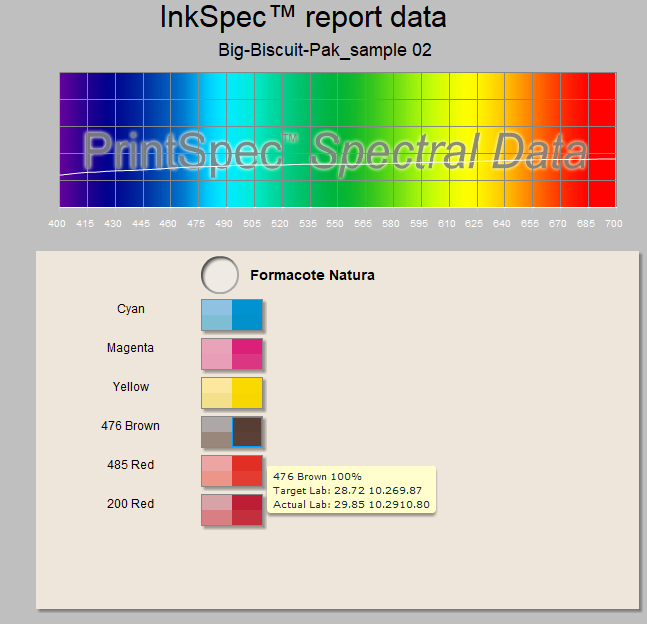
- Is there an in line spectral measurement system or colour bar scanning system for closed loop colour control?
- At what point are print production samples collected for QA measurement and reporting?
It is now more important than ever to have good process control and quality control in place to remain a front line packaging provider, even more so when you are having to reproduce a range of ever increasing bolder and adventurous special colours and specialised finishes.
Colour measurement procedures and quality reports will minimise the need for on-site press checks and will allow to keep your finger on pulse of your colour quality.
-
Are you using the right instrument for your colour measurement?
Densitometer or Spectrophotometer? What kind of Spectrophotometer? You will need a spectrophotometer for measuring and monitoring colour - capturing spectral data for L*a*b* co-ordinates for reporting compared to target values.
What type of instrument geometry for my spectrophotometer - 45/0 or Spherical or Multi-Angle? For most standard kind son print a 45/0 or 0/45 instrument will suffice. For more specialized print finishes that are highly glossed or textured or use metallic inks then you may require a Sphere type of Spectrophotometer. A sphere instrument can measure your print sample with or without the effect of the specialised high gloss finish for example.
-
Achieving Colour on a Practical Level
It is one thing to provide a colour specification but it may not be achievable across all facets of the promotional materials and items. You may have a beautifully produced offset printed carton package in prime position in the store, but this needs to go together with wide format produced POS display and signage and digital print product flyers.
Trying to get all these components to match can be challenge, but not an impossibility. Realizing limitations of each print process, the types of CMYK and/or special colour inks used may mean that the dE tolerances might have to be wider or broader than first expected.
This is where new standardized formats for exchange of colour information can help designers - think CxF for digital exchange of colour data.
-
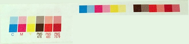
Still using a hard copy colour reference
Sometimes referred to as a physical reference - this can take the form of folder containing a previously printed sample that has been 'signed off' by the customer and/or quality dept. Or the reference may be in the form of an ink draw down sample from the ink supplier or ink company. The draw down is ideally produced using the special colour ink formulated for you, and the draw down printed on the substrate you will finally print with.
A physical reference or draw down has practical benefits of actually seeing the colour and aids in providing a colour expectation with a manageable result. However any physical reference or sample can be subject to 'wear and tear' over time through mishandling - it can become damaged, and could fade. A physical reference will always be subject to opinion whether the colour matches or not.
Measurement values, from the physical reference, provide a secure aim point for colour - used together with an achievable dE tolerance value (a dE of of between 2-3 is common today for brand special colours, using dE2000 method). This means we are introducing a digital colour resource that will not change, fade, go out for date and provides a level of traceability.
A hard copy colour reference is great, and still has a place, but only when used with a set of correctly specified L*a*b* co-ordinates and a realistic (process achievable)dE tolerance.
-
Standardisation
We often get asked to come in and 'finger print our press'. This is great, and part of the support services we offer, but I often get a quizzed look when I ask:
- What is the process target?
- What process control and colour quality management system is in place to measure, monitor and maintain it after I leave?
- Is the maintenance up to date for the press? Any outstanding print issues?
Whether you agree or not with setting up your print process to an ISO standard is not the point here. Standardisation can also mean setting up to in-house standard, provided it is clearly defined.
Standardisation of colour in print provides numerous benefits, internally and externally for your company.
- Improved communication between prepress, print dept, sales and management
- Faster Make Ready and/or print preparation
- Less 'fiddling' on press
- Less wastage
- Increased press and equipment utilisation
- Colour predictability & consistency
- Improved colour fidelity of print to proof
- Fewer surprises
- Better communication between you and your customer(s)
For more information about the benefits of setting up a Colour Quality Management System, using the advanced TECHKON SpectroDens and our unique ICC Profiling service please contact us at info@colourgraphicservices.com
