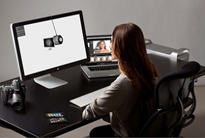
Monitor calibration is the place the start with getting your colour management set up correctly.
In our last blog "Why you should calibrate your monitor" we spoke about the benefits of calibrating your monitor and provided some food for thought on the settings and environment.
Now, I will outline the calibration process and what settings to use, based on two scenarios - Photographers workflow and Print Reproduction workflow.
Please keep in mind that space and time does not allow us to explain everything in complete and minute detail, and, importantly, why doesn't my printer match my monitor. Also, it is possible to perform 'software or hardware' monitor calibration - this depends on the monitor type and capability (the differences are not discussed here).
An Outline of the Monitor Calibration Process
(Based on using a colorimeter or spectrophotometer and monitor calibration software):
- Make sure your monitor has been on for a couple of hours - disable screen savers, power savers, etc.
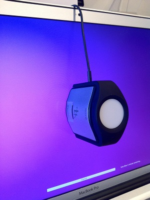
- Run through the software installation (re-start if necessary) and connect the colorimeter or spectrophotometer (spectro) into a USB port on your computer.
- Start up the monitor calibration software, check and apply the settings*, proceed through the step by step instructions given by the software.
- Position the colorimeter/spectro onto the monitor, usually around the centre of the screen.
- The calibration software will then display a series of coloured patches (this could be a few patches to several hundred) that will be measured by the colorimeter/spectro. The software records the measured values compared to the actual values of each patch.
- In the case of 'software' calibration there will be adjustment to the video card RGB output in order to achieve colour closest to the settings and targets used.
- At the conclusion an ICC profile is 'built' and saved into the correct directory/folder for the Windows or Mac OS to use as the default monitor ICC profile. Photo, design, page make up and retouching applications like PhotoShop, Illustrator, InDesign and Acrobat will recognise this monitor profile.
Is that it? Now my monitor will match my printer, or vice versa? Well not exactly. We now have a calibrated monitor, measured and defined - and as it is calibrated we should be able to keep it at that point - i.e. we can bring it back into 'line' by re-calibration to the same settings! We can also check it by running a 'validation' or 'quality check' routine, available with most monitor calibration packages. You 'should check' the calibration once a week.
* Settings - You can see that monitor calibration can basically be broken down into two parts - Calibration and ICC profiling. The two are linked...
Calibration involves choosing and deciding settings for (and not necessarily always in this order and there may be other settings, depending on the monitor calibration software):
- Luminance (cd/m2) or Brightness
- White Point (Colour Temperature)
- Black Point or Black level (cd/m2)
- Gamma (usually 1.8 or 2.2)
- Matrix or LUT profile
- Profile v2 or v4
Photographers Workflow Settings
(NOTE: these should be taken as a guide only and as a starting point)
- Luminance: 100~160 cd/m2 - depends on your ambient lighting, whether you doing soft proofing, studio/room conditions, etc.
- White Point: 5500~6500 - between 5500-6000 will be preferred for soft proofing
- Black Point: .3~.5 - this will control the contrast ratio - a lower value may provide a black point that too dark and a contrast ratio that is greater than you 'print' - the contrast ratio should be between 250-300 - Contrast ratio can be calculated by Brightness cd/m2 divided by Black Point cd/m2.
- Gamma: 2.2 - but you can use 1.8 or L* - 2.2 aligns with Adobe-RGB.
- Matrix or LUT profile: follow the recommendations of the software - The latest application software now support LUT profiles and they can be more accurate.
- Profile version - v2 or v4: Use v4 as it is now the latest version of ICC - if you have a problem of the profile not being recognised you may have to use v2.
Print Reproduction Workflow Settings
(NOTE: these should be taken as a guide only and as a starting point).
- Luminance: 100~160 cd/m2 - with soft proofing the viewing system should have a dimmer to enable adjustment to match the monitor's 'brightness' - some software allows this to be completed by measurement - this is the critical point for soft proofing - also you should consider your ambient lighting, wall colours and surrounds, studio/room conditions, etc.
- White Point: 5000~5800 - between 5000-5800 will be preferred for soft proofing and to enable a close 'match' to the paper/substrate.
- Black Point: .3~.5 - this will control the contrast ratio - a lower value may provide a black point that too dark and a contrast ratio that is greater than you 'print' or the ICC print profile being used as the simulation - the contrast ratio should be between 250-300 - Contrast ratio can be calculated by Brightness cd/m2 divided by Black Point cd/m2.
- Gamma: 1.8 - but you can use 2.2 or L*
- Matrix or LUT profile: follow the recommendations of the software - Most of the latest application software now supports LUT profiles and they can be more accurate.
- Profile version - v2 or v4: Use v4 as it is now the latest version of ICC - if you have a problem of the profile not being recognised you may have to use v2.
What are the Key Points?
- The above settings are a guide and stating point only.
- Achieving good print to screen matching depends on may things.
- Ambient room lighting
- Using correct lighting (D50) or viewing system for soft proofing
- Room/wall/surrounding colour - should neutral/grey
- You are trying to trick the eye/brain combination to match emissive colour (RGB monitor) with reflected colour (CMYK print)
- You will need to tweak the monitor calibration settings/colour - this is NOT cheating - it is a reality!
- Using a good quality, hardware calibration capable monitor with a hood will improve what is achievable
- Use the correct application software settings to show a soft proof
- Use D50 lighting for assessing colour in printed results
- Take control of your ambient lighting and surrounds
- Use a good quality monitor, the best you can afford - with monitors we always say you only get what you pay for!
Want to learn more? Contact us at info@colourgraphicservices.com for colour management training and complete colour management solutions.
